Keyboard shortcuts interface for your website. Working with static HTML, Vanilla JS, Vue, React, Svelte.
npm install ninja-keysNinja Keys
Keyboard shortcut interface for your website that works with Vanilla JS, Vue, and React.



Demo
https://ninja-keys-demo.vercel.app/

Motivation
A lot of applications support a common pattern where the user hits ⌘+k (or ctrl+k) and a search UI dialog appears. I've recently seen this in Notion, Slack, Linear, Vercel and Algolia, but I'm sure there are plenty more. Apple Spotlight, Alfred and the Raycast app also have a similar pattern, but with different shortcuts. There are already some libraries built for this, but they are too framework specific, like Laravel only or React only Nevertheless, mine is not a silver bullet and if you need more framework integration, check them out too.
I needed a keyboard interface for navigation with static websites without any frameworks. At the same time, I have a few Vue projects where something like this could be useful, so I decided to give it a try for Web Components and Lit Element.
Integrations
- Vue 3 Example - Codesandbox
- Vue 2 Example - Codesandbox
- React Example - Codesandbox
- React/NextJS
- Static Html - Codesandbox
- Svelte - Codesandbox
- SolidJS wrapper
Features
- Keyboard navigation
- Light and dark theme built in
- Built-in icon support from Material font and custom svg icons
- Nested menu - a tree or flat data structure can be used
- Auto register your shortcuts
- Root search - for example, if you search "Dark," it will find it within the "Theme" submenu
- CSS variable to customize the view
- Customizable hotkeys to open/close etc. Choose what best fits your website.
Why the "Ninja" name?
Because it appears from nowhere and executes any actions quickly... Or because it allows your users to become keyboard ninjas 🙃
Install from NPM
npm i ninja-keys
Import if you are using webpack, rollup, vite or other build system.
import 'ninja-keys';
Install from CDN
Mostly for usage in HTML/JS without a build system.
<script type="module" src="https://unpkg.com/ninja-keys?module"></script>
or inside your module scripts
<script type="module">
  import {NinjaKeys} from 'https://unpkg.com/ninja-keys?module';
</script>
Usage
Add the tag to your HTML.
<ninja-keys> </ninja-keys>
<script>
  const ninja = document.querySelector('ninja-keys');
  ninja.data = [
    {
      id: 'Projects',
      title: 'Open Projects',
      hotkey: 'ctrl+N',
      icon: 'apps',
      section: 'Projects',
      handler: () => {
        // it's auto register above hotkey with this handler
        alert('Your logic to handle');
      },
    },
    {
      id: 'Theme',
      title: 'Change theme...',
      icon: 'desktop_windows',
      children: ['Light Theme', 'Dark Theme', 'System Theme'],
      hotkey: 'ctrl+T',
      handler: () => {
        // open menu if closed. Because you can open directly that menu from it's hotkey
        ninja.open({ parent: 'Theme' });
        // if menu opened that prevent it from closing on select that action, no need if you don't have child actions
        return {keepOpen: true};
      },
    },
    {
      id: 'Light Theme',
      title: 'Change theme to Light',
      icon: 'light_mode',
      parent: 'Theme',
      handler: () => {
        // simple handler
        document.documentElement.classList.remove('dark');
      },
    },
    {
      id: 'Dark Theme',
      title: 'Change theme to Dark',
      icon: 'dark_mode',
      parent: 'Theme',
      handler: () => {
        // simple handler
        document.documentElement.classList.add('dark');
      },
    },
  ];
</script>
Library using flat data structure inside, as in the example above. But you can also use a tree structure as below:
{
  id: 'Theme',
  children: [
    { id: 'light' title: 'light_mode', },
    { id: 'System Theme',
      children: [
        { title: 'Sub item 1' },
        { title: 'Sub item 2' }
      ]
    }
  ]
}
Attributes
| Field | Default | Description |
|---|---|---|
| placeholder | Type a command or search... | Placeholder for search |
| disableHotkeys | false | If attribute exist will register all hotkey for all actions |
| hideBreadcrumbs | false | Hide breadcrumbs on header if true |
| openHotkey | cmd+k,ctrl+k | Open or close shortcut |
| navigationUpHotkey | up,shift+tab | Navigation up shortcuts |
| navigationDownHotkey | down,tab | Navigation down shortcuts |
| closeHotkey | esc | Close shortcut |
| goBackHotkey | backspace | Go back on one level if has parent menu |
| selectHotkey | enter | Select action and execute handler or open submenu |
| hotKeysJoinedView | false | If exist/true will display hotkeys inside one element |
| noAutoLoadMdIcons | false | If exist it disable load material icons font on connect |
Example
<ninja-keys placeholder="Must app is awesome" openHotkey="cmd+l" hideBreadcrumbs></ninja-keys>
Data
Array of INinjaAction - interface properties below
| Name | Type | Description |
|---|---|---|
| id | string | Unique id/text. Will be displayed as breadcrumb in multimenu |
| title | string | Title of action |
| hotkey | string(optional) | Shortcut to display and register |
| handler | Function(optional) | Function to execute on select |
| mdIcon | string(optional) | Material Design font icon name |
| icon | string(optional) | Html to render as custom icon |
| parent | string(optional) | If using flat structure use id of actions to make a multilevel menu |
| keywords | string(optional) | Keywords to use for search |
| children | Array(optional) | If using flat structure then ids of child menu actions. Not required on tree structure |
| section | string(optional) | Section text. Like a header will be group with other same sections |
Methods
| Name | Arg | Description |
|---|---|---|
open |
{ parent?: string } | Open menu with parent, if null then open root menu |
close |
Close menu | |
setParent |
parent?: string | Navigate to parent menu |
Example
const ninja = document.querySelector('ninja-keys');
ninja.open()
// or
ninja.open({ parent: 'Theme' })
Events
Component wide events
| Name | Description | Payload |
|---|---|---|
change |
Emitted when on each change of search input | { detail: { search: string, actions: Array<NinjaAction> } } |
selected |
Emitted when on user selected action or on submit of input | { detail: { search: string, action: NinjaAction or undefined }} |
Both handler of action and component event selected emitted when user submit form or select item.
But event selected can be used to handle edge cases, so it's not recommended to write each action logic here. It’s better to use the action handler property.
For example, if a user enters a search query and there is an empty list, listening to this event you can handle that.
ninja.addEventListener('change', (event) => {
  console.log('ninja on change', event.detail);
  // detail = {search: 'your search query', actions: Array<NinjaAction>}
})
ninja.addEventListener('selected', (event) => {
  console.log('ninja on selected', event.detail);
  // detail = {search: 'your search query', action: NinjaAction | undefined }
  if (event.detail.action){
  // perform API search for example
  }

})
Themes
Component supports a dark theme out-of-box. You just need to add a class.
<ninja-keys class="dark"></ninja-keys>
If you need more style control, use any of the CSS variables below.
CSS variables
| Name | Default |
|---|---|
| --ninja-width | 640px; |
| --ninja-backdrop-filter | none; |
| --ninja-overflow-background | rgba(255, 255, 255, 0.5); |
| --ninja-text-color | rgb(60, 65, 73); |
| --ninja-font-size | 16px; |
| --ninja-top | 20%; |
| --ninja-key-border-radius | 0.25em |
| --ninja-accent-color | rgb(110, 94, 210); |
| --ninja-secondary-background-color | rgb(239, 241, 244); |
| --ninja-secondary-text-color | rgb(107, 111, 118); |
| --ninja-selected-background | rgb(248, 249, 251); |
| --ninja-icon-color | var(--ninja-secondary-text-color); |
| --ninja-icon-size | 1.2em; |
| --ninja-separate-border | 1px solid var(--ninja-secondary-background-color); |
| --ninja-modal-background | #fff; |
| --ninja-modal-shadow | rgb(0 0 0 / 50%) 0px 16px 70px; |
| --ninja-actions-height | 300px; |
| --ninja-group-text-color | rgb(144, 149, 157); |
| --ninja-footer-background | rgba(242, 242, 242, 0.4); |
| --ninja-placeholder-color | #8e8e8e |
| --ninja-z-index | 1 |
Example
ninja-keys {
  --ninja-width: 400px;
}
CSS Shadow Parts
Allowing you to style specific elements from your style.
Because styles are encapsulated by Shadow DOM, it will be annoying to create css variables for all properties.
That's why you can use ::part to make a custom look for the component.
It's supported by all modern browsers
| Name | Description |
|---|---|
| actions-list | Element that wraps all child elements. |
| ninja-action | Single action |
| ninja-selected | Selected action |
| ninja-input | Input element |
| ninja-input-wrapper | Wrapper element around div, useful for advanced styles |
Example style using parts
ninja-keys::part(actions-list) {
  padding: 8px;
}
ninja-keys::part(ninja-action) {
  border-radius: 8px;
  border-left: none;
}

ninja-keys::part(ninja-selected) {
  background: rgba(51, 51, 51, 0.1);
}


ninja-keys::part(ninja-input) {
  color: #14b8a6;
}

ninja-keys::part(ninja-input)::placeholder {
  color: #f43f5e;
}

ninja-keys::part(ninja-input-wrapper) {
  background: rgba(244, 63, 93, 0.3);
}
Icons
By default, components use icons from https://fonts.google.com/icons
For example, you can just set mdIcon to light_mode to render a sun icon.
To add Material icons for your website, you need to add them to your HTML, for example
<link href="https://fonts.googleapis.com/css?family=Material+Icons&display=block" rel="stylesheet">
If you want custom icons, you can use svg or img to insert it with an icon property for action with ninja-icon class.
Example:
{
  title: 'Search projects...',
  icon: `<svg xmlns="http://www.w3.org/2000/svg" class="ninja-icon" fill="none" viewBox="0 0 24 24" stroke="currentColor">
    <path stroke-linecap="round" stroke-linejoin="round" stroke-width="2" d="M7 8h10M7 12h4m1 8l-4-4H5a2 2 0 01-2-2V6a2 2 0 012-2h14a2 2 0 012 2v8a2 2 0 01-2 2h-3l-4 4z" />
  </svg>`,
  section: 'Projects',
},
You can also change the width and font using CSS variables
ninja-keys {
  --ninja-icon-size: 1em;
}
Change or hide footer
<ninja-keys>
  <div slot="footer">You can use a custom footer or empty div to hide it</div>
</ninja-keys>
Dev Server
npm run start
Linting
To lint the project run:
npm run lint
Formatting
Prettier is used for code formatting. It has been pre-configured according to the Lit's style.
License
Copyright (c) Sergei Sleptsov hey@sergei.ws
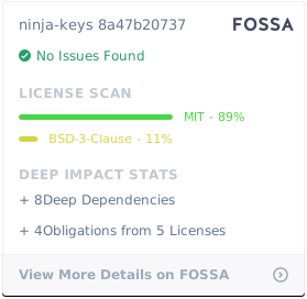
Licensed under the MIT license.