An open-source collection of copy-and-paste shadcn components, blocks, and templates - paired with a powerful theme generator to craft, customize, and ship faster.
npm install shadcn-studio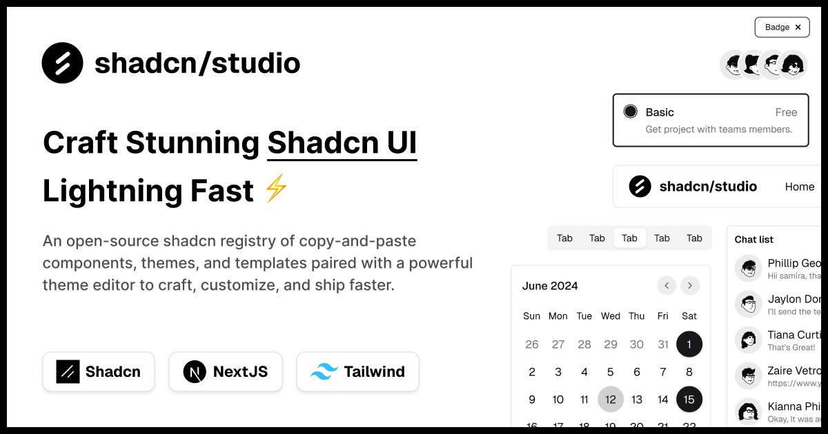
shadcn/studio is an open-source collection of copy-and-paste shadcn components, blocks, and templates - paired with a powerful theme generator & AI Tools to craft, customize, and ship faster. 🚀



Supported by ThemeSelection, with a commitment to empowering the open-source community.
Table of Contents 📋
- Table of Contents 📋
- Overview 🌏
- Why should I use shadcn/studio? 💡
- This is where shadcn/studio shines ✨
- Features ✨
- Documentation 📚
- Available Components 🧩
- Community 🤝
- Credits 🤘
- License ©
- Useful Links 🎁
Overview 🌏
This isn't a traditional component library or a replacement for Shadcn. Instead, it's a unique collection offers customizable variants of components, blocks, and templates. Preview, customize, and copy-paste them into your apps with ease.
Building on the solid foundation of the Shadcn components & blocks, we've enhanced it with custom-designed components & blocks to give you a head start. This allows you to craft, customize, and ship your projects faster and more efficiently.
Not a standard library, but a distribution of components
Following the philosophy of Shadcn, shadcn/studio isn't a conventional "install-from-NPM" library. Rather, it's an open-source distribution of components designed for maximum adaptability. You can copy the code, modify styles, adjust logic, or integrate it with other tools—free from the limitations of typical libraries. This "open code" model empowers you to customize with confidence and creativity.
Why should I use shadcn/studio? 💡
shadcn/ui aims to provide core components with a unique distribution system, allowing developers to copy and paste reusable, customizable UI elements directly into their codebase.
While this approach offers flexibility and control, it comes with some limitations: a lack of diverse component variants examples, limited theme customization options, and limited pre-built blocks. Additionally, its extensive customization options, though powerful, can sometimes feel overwhelming, especially for those seeking a more guided or streamlined experience.
This is where shadcn/studio shines ✨
An open-source & premium collection of copy-and-paste shadcn components, blocks, and templates - paired with a powerful theme generator to craft, customize, and ship faster 🚀. It provides a robust toolkit for building stunning, interactive user interfaces with ease.
Open-source: Dive into a growing, community-driven collection of copy-and-paste shadcn/ui components, shadcn blocks, and templates.
Component & Blocks variants: Access a diverse, collection of customizable shadcn blocks and component variants to quickly build and style your UI with ease.
Animated variants with Motion: Add smooth, modern animations to your components, enhancing user experiences with minimal effort.
Landing pages & Dashboards: Explore 20+ premium & free Shadcn templates for dashboards, landing pages & more. Fully customizable & easy to use.
shadcn/ui for Figma: Speed up your workflow with Shadcn Figma UI components, blocks & templates — a full design library inspired by shadcn/ui.
Powerful theme generator: Customize your UI instantly with Shadcn Theme Generator. Preview changes in real time and create consistent, on-brand designs faster.
shadcn/studio MCP: Integrate shadcn/studio MCP Server directly into your favorite IDE and craft stunning shadcn/ui Components, Blocks and Pages inspired by shadcn/studio.
Shadcn Figma To Code Plugin: Convert your Figma designs into production-ready code instantly with the Shadcn Figma Plugin.
Features ✨
- Live Theme Generator: See your shadcn components transform instantly as you experiment with styles in real time.
- Color Mastery: Play with background, text, and border hues using a sleek color picker for a unified design.
- Typography Fine-Tuning: Perfect your text with adjustable font sizes, weights, and transformations for a polished look.
- Tailwind v4 Compatibility: Effortlessly use Tailwind v4, supporting OKLCH, HSL, RGB & HEX color formats.
- Stunning Theme Starters: Kick off with gorgeous pre-built themes and customize light or dark modes in a breeze.
- Hold to Save Theme: Preserve your custom themes with a quick hold, making them easy to reuse or share later.
Documentation 📚
For comprehensive documentation, please visit shadcnstudio.com.
Available Components 🧩
shadcn/studio provides an open-source collection of copy-and-paste Shadcn Components designed to accelerate your project development. Below is a summary of the available component categories:
Component Examples
| Avatar | Badge | Breadcrumb |
|
|
|
Community 🤝
Join the shadcn/studio community to discuss the library, ask questions, and share your experiences:
Credits 🤘
We are grateful for the contributions of the open-source community, particularly:
These projects form the backbone of shadcn/studio, allowing us to build a powerful copy-and-paste components.
License ©
- Copyright © ThemeSelection
- Licensed under MIT
- shadcn/studio is an open-source collection of copy-and-paste shadcn components, blocks, and templates - paired with a powerful theme generator to craft, customize, and ship faster.