Voltar ao ranking

PaoloCuscela/Cards

Swift

Awesome iOS 11 appstore cards in swift 5.

cardsiosios11swiftswift4uikituiibdesignablestoryboardswift5
Crescimento de estrelas
Estrelas
4.2k
Forks
271
Crescimento semanal
Issues
25
4.2k
18 de jul.19 de jul.20 de jul.22 de jul.
README

GitHub Stars Pod Version Platform License

Overview

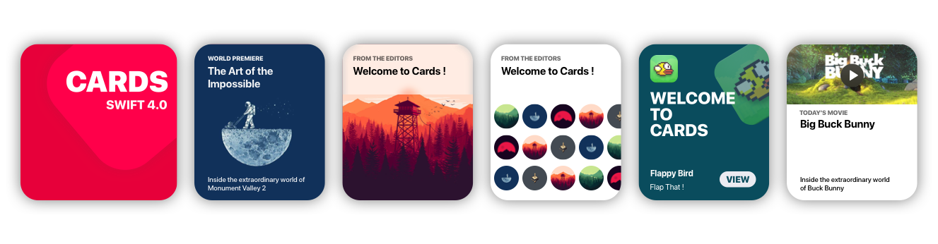
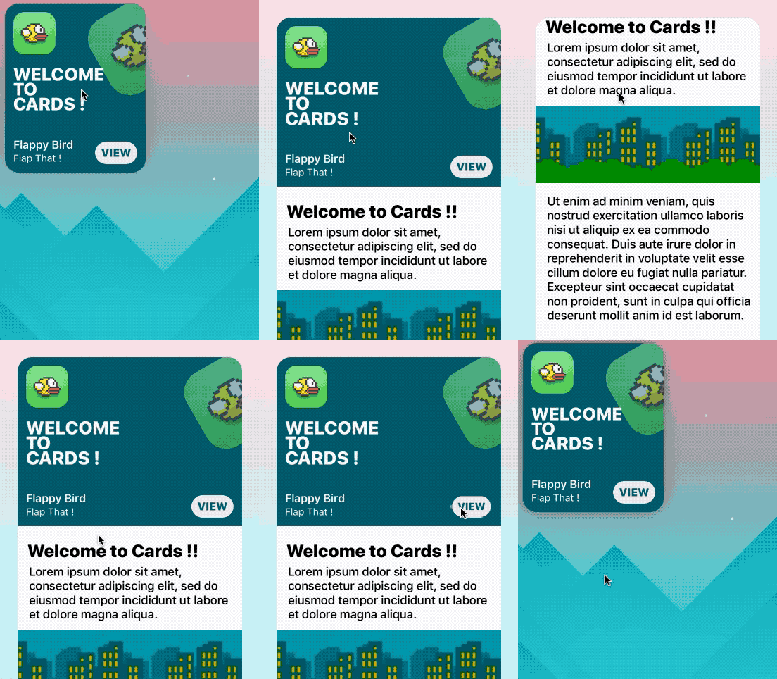
Cards brings to Xcode the card views seen in the new iOS XI Appstore.

Getting Started

Storyboard

  • Go to main.storyboard and add a blank UIView
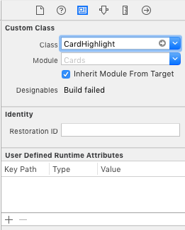
  • Open the Identity Inspector and type 'CardHighlight' the 'class' field
  • Make sure you have 'Cards' selected in 'Module' field
  • Switch to the Attributes Inspector and configure it as you like.

CardViewStoryboard

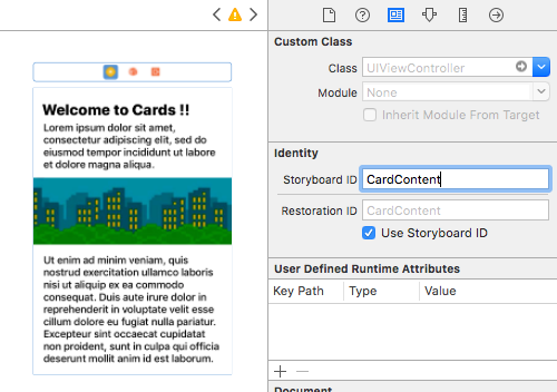
  • Drag a blank UIViewController and design its view as you like
  • Move to the Identity inspector
  • Type 'CardContent' in the StoryboardID field.

DetailViewStoryboard

Code

import Cards

// Aspect Ratio of 5:6 is preferred
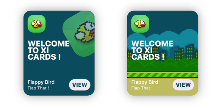
let card = CardHighlight(frame: CGRect(x: 10, y: 30, width: 200 , height: 240))

card.backgroundColor = UIColor(red: 0, green: 94/255, blue: 112/255, alpha: 1)
card.icon = UIImage(named: "flappy")
card.title = "Welcome \nto \nCards !"
card.itemTitle = "Flappy Bird"
card.itemSubtitle = "Flap That !"
card.textColor = UIColor.white
    
card.hasParallax = true
    
let cardContentVC = storyboard!.instantiateViewController(withIdentifier: "CardContent")
card.shouldPresent(cardContentVC, from: self, fullscreen: false)
    
view.addSubview(card)

GetStarted

Prerequisites

  • Xcode 10.2 or newer
  • Swift 5.0

Installation

Cocoapods

use_frameworks!
pod 'Cards'

Manual

  • Download the repo
  • ⌘C ⌘V the 'Cards' folder in your project
  • In your Project's Info go to 'Build Phases'
  • Open 'Compile Sources' and add all the files in the folder

Overview

Customization

//Shadow settings
var shadowBlur: CGFloat
var shadowOpacity: Float
var shadowColor: UIColor
var backgroundImage: UIImage?
var backgroundColor: UIColor

var textColor: UIColor 	//Color used for the labels
var insets: CGFloat 	//Spacing between content and card borders
var cardRadius: CGFloat //Corner radius of the card
var icons: [UIImage]? 	//DataSource for CardGroupSliding
var blurEffect: UIBlurEffectStyle //Blur effect of CardGroup

Usage

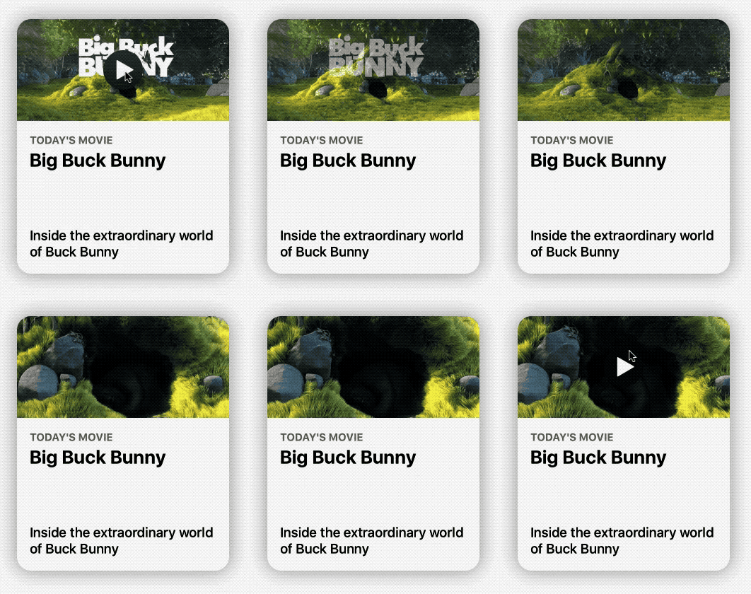
CardPlayer

let card = CardPlayer(frame: CGRect(x: 40, y: 50, width: 300 , height: 360))
card.textColor = UIColor.black
card.videoSource = URL(string: "http://clips.vorwaerts-gmbh.de/big_buck_bunny.mp4")
card.shouldDisplayPlayer(from: self)    //Required. 
        
card.playerCover = UIImage(named: "mvBackground")!  // Shows while the player is loading
card.playImage = UIImage(named: "CardPlayerPlayIcon")!  // Play button icon
        
card.isAutoplayEnabled = true
card.shouldRestartVideoWhenPlaybackEnds = true
        
card.title = "Big Buck Bunny"
card.subtitle = "Inside the extraordinary world of Buck Bunny"
card.category = "today's movie"
        
view.addSubview(card)

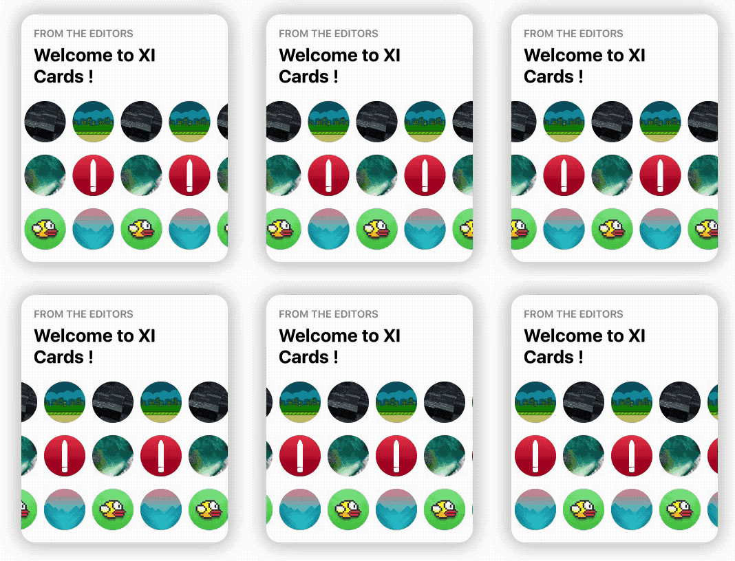
CardGroupSliding

    let icons: [UIImage] = [    
    
        UIImage(named: "grBackground")!,
        UIImage(named: "background")!,
        UIImage(named: "flappy")!,
        UIImage(named: "flBackground")!,
        UIImage(named: "icon")!,
        UIImage(named: "mvBackground")!
    
    ]   // Data source for CardGroupSliding
    
    let card = CardGroupSliding(frame: CGRect(x: 40, y: 50, width: 300 , height: 360))
    card.textColor = UIColor.black
    
    card.icons = icons
    card.iconsSize = 60
    card.iconsRadius = 30
    
    card.title = "from the editors"
    card.subtitle = "Welcome to XI Cards !"

    view.addSubview(card)

Documentation

See the Wiki, to learn in depth infos about Cards.
GO!

Issues & Feature requests

If you encounter any problems or have any trouble using Cards, feel free to open an issue. I'll answer you as soon as I see it.

New features, or improvements to the framework are welcome (open an issue).

Thanksto

License

Cards is released under the MIT License.

Repositórios relacionados
Devlight/InfiniteCycleViewPager

Infinite cycle ViewPager with two-way orientation and interactive effect.

JavaMavenApache License 2.0infinite-scrollviewpager
5.7k821
Yalantis/Koloda

KolodaView is a class designed to simplify the implementation of Tinder like cards on iOS.

SwiftMIT Licenseiosswift
yalantis.com
5.4k803
Clooos/Bubble-Card

Bubble Card is a minimalist card collection for Home Assistant with a nice pop-up touch.

JavaScriptnpmMIT Licensecustom-cardcustom-cards
4.4k167
nolimits4web/atropos

Stunning touch-friendly 3D parallax hover effects

JavaScriptnpmMIT Licensejavascriptgallery
atroposjs.com
3.6k107
themesberg/flowbite-svelte

Official Svelte components built for Flowbite and Tailwind CSS

CSSnpmMIT Licensesveltecomponents
flowbite-svelte.com
2.8k330
mcxtzhang/ZLayoutManager

Some custom LayoutManager .Such as SwipeCard、FLowLayout。一些自定义的LayoutManager,仿探探、人人影视 炫动滑动 卡片层叠 和流式布局等。

JavaMavenlayoutmanagercard
blog.csdn.net/zxt0601/article/details/53730908
2.5k390
intuit/CardParts

A reactive, card-based UI framework built on UIKit for iOS developers.

SwiftOtherswiftios
2.5k221
microsoft/AdaptiveCards

A new way for developers to exchange card content in a common and consistent way.

C#MIT Licensecardsbot-framework
adaptivecards.io
2k597
JoniVR/VerticalCardSwiper

A marriage between the Shazam Discover UI and Tinder, built with UICollectionView in Swift.

SwiftMIT Licenseshazamuicollectionview
1.5k100
nextcloud/deck

🗂 Kanban-style project & personal management tool for Nextcloud, similar to Trello

JavaScriptnpmGNU Affero General Public License v3.0selfhostedorganization
apps.nextcloud.com/apps/deck
1.4k346
michael-rapp/ChromeLikeTabSwitcher

Provides a tab switcher similar to the one, which is used in Google Chrome on Android

JavaMavenApache License 2.0googlechrome
1.2k140
saoudrizwan/CardSlider

Tinder cards with a twist

Swiftiosswift
1.2k93